BRONZE
BRONZE 등급의 판매자 자료
New York Times and USA Today
This is a newspaper critique written in English.
I got A on this paper in the U.S.
This is about the comparison between New York Times and USA Today including apperance, organiztion, content, strength and weakness.
5 페이지
 워드
워드
최초등록일 2006.10.20
최종저작일
2006.10
-
미리보기
소개
This is a newspaper critique written in English.
I got A on this paper in the U.S.
This is about the comparison between New York Times and USA Today including apperance, organiztion, content, strength and weakness.목차
I. Appearance
II. Content
III. Organization
IV. Strengths and Weakness본문내용
Newspaper Critiques
USA Today: September 12, 2006 & September 25, 2006
New York Times: September 12, 2006 & September 25, 2006
I. Appearance
As far as the appearance is concerned, USA Today seems colorful and graphic, and it makes the newspaper look public. On the other hand, New York Times seems dark and dull, but it makes the newspaper look deep and professional. For example, regarding to the first page of each newspaper, USA today has 6 color pictures and colorful fonts on September 12, 2006, compared to New York Times with 3 color pictures and only black font at the very same day. The section A of USA Today contains 51 pictures and tables, and that of New York Times contains 41 pictures and tables on September 12, 2006. USA Today, on the whole, seems to focus on general readers in that these colorful pictures and fonts are more eye-catching than simple design is. New York Times, however, seems not to be shaken by the interest of readers or the trend of newspaper industry.
As far as the shape is concerned, USA Today is more slender than New York Times is. I think this is one instance that USA Today is reader-friendly, because it is easy for readers to hold and fold the newspaper and to turn the page.
Both New York Times and USA today indicate the price of their newspaper on the first page. It is obvious that USA Today is cheaper than New York Times, and readers who have no certain taste could choose cheaper one. However, there is one interesting strategy on the first page of New York Times.참고자료
· 없음태그
-
자료후기
 Ai 리뷰지식판매자가 등록한 자료는 과제에 직접 활용할 수 있는 유용한 내용이 많아, 큰 도움이 되었습니다. 앞으로도 계속 좋은 자료 부탁드립니다! 감사합니다.
 -
자주묻는질문의 답변을 확인해 주세요

꼭 알아주세요
-
자료의 정보 및 내용의 진실성에 대하여 해피캠퍼스는 보증하지 않으며, 해당 정보 및 게시물 저작권과 기타 법적 책임은 자료 등록자에게 있습니다.
자료 및 게시물 내용의 불법적 이용, 무단 전재∙배포는 금지되어 있습니다.
저작권침해, 명예훼손 등 분쟁 요소 발견 시 고객센터의 저작권침해 신고센터를 이용해 주시기 바랍니다. -
해피캠퍼스는 구매자와 판매자 모두가 만족하는 서비스가 되도록 노력하고 있으며, 아래의 4가지 자료환불 조건을 꼭 확인해주시기 바랍니다.
파일오류 중복자료 저작권 없음 설명과 실제 내용 불일치 파일의 다운로드가 제대로 되지 않거나 파일형식에 맞는 프로그램으로 정상 작동하지 않는 경우 다른 자료와 70% 이상 내용이 일치하는 경우 (중복임을 확인할 수 있는 근거 필요함) 인터넷의 다른 사이트, 연구기관, 학교, 서적 등의 자료를 도용한 경우 자료의 설명과 실제 자료의 내용이 일치하지 않는 경우
함께 구매한 자료도 확인해 보세요!
-
success in college
3페이지
Because your success in the college can lead you to better world, higher salary, and more options you can choose during your lifetime. It is on your hand to start doing well and have good habit. Not o..
-
 [인문어학]타임지 해석본 The TIMES
11페이지
The anorexic patient`s inability to see her body as it is has long fascinated researchers. While other manifestations of the illness (an obsession with weight and food, an intense fear of being fat) c..
[인문어학]타임지 해석본 The TIMES
11페이지
The anorexic patient`s inability to see her body as it is has long fascinated researchers. While other manifestations of the illness (an obsession with weight and food, an intense fear of being fat) c.. -
[신문학]미국의 USA TODAY 신문의 역사와 특징, 마케팅 전략에 대해
7페이지
USA today는 1982년에 미국의 첫 보편 적인 일간지로 뉴스 및 정보 관련회사인 개닛(Gannett Co. Inc.)이 발행했다. 미국 5대 신문 가운데서 역사가 가장 짧으며, 《뉴욕타임스》《월스트리트저널》이 지방 을 토대로 시작되어 발전하였고 현재도 그런 성향이 강하기 때문에, 전국을 무대 로 발행되는 중앙지 개념의 신문으로는 유일하다. 부제는 T..
-
[신문방송]usa today 성공에 대한 분석과 기사의 특징
6페이지
미국에서 가장 빨리 성장한 신문 가운데 하나가 《USA 투데이》다. 개니트사가 1982년 창간한 이 신문은 꾸준한 성장세를 보여 1990년대 들어 《월스트리트 저널》에 이어 미국 내 발행부수 2위로 떠올랐다. 미국 ABC의 보고서에 따르면 이 신문의 평일 발행 부수는 159만 1629부(주말까지 팔리는 금요판의 경우 200만부)였다. 1995년 같은 기간에..
찾으시던 자료가 아닌가요?
지금 보는 자료와 연관되어 있어요!

-
공학/기술

- 거버너스아일랜드 설계분석
- *용* | 61 페이지
- 3,000원

-
경영/경제
- Home Depot financial statement PPT [홈디포 재무제표 및 조직환경에 대한 영문 PPT]
- *정* | 20 페이지
- 2,000원
-
인문/어학
- [영작문] 사형제도 찬반론
- *준* | 7 페이지
- 3,000원
-
공학/기술
- [전자상거래] 국내외 신문사 웹사이트 분석(동아일보, 조선일보, 뉴욕타임즈, 시카고트리뷴)
- *지* | 41 페이지
- 4,000원


-
인문/어학
- 미국문화에 대한 파워포인트자료
- *영* | 24 페이지
- 3,000원
-
경영/경제
- Disadvantages of vacation ownership
- *연* | 3 페이지
- 1,000원
-
경영/경제
- Jack Welch(John Frances Welch Jr) English
- 지식창고 | 19 페이지
- 2,000원
-
인문/어학
- [영어작문]에세이-레스토랑 식당종류
- *민* | 2 페이지
- 1,500원
-
인문/어학
- Alcohol abuse 에 대한 영어 작문
- *지* | 6 페이지
- 2,000원
-
사회과학
- The Strong Jewish Power in US financial market
- *두* | 7 페이지
- 1,500원
-
사회과학
- [신문학]미국의 USA TODAY 신문의 역사와 특징, 마케팅 전략에 대해
- *경* | 7 페이지
- 1,500원
-
경영/경제
- 폴로랄프로렌의 브랜드마케팅 영문PPT
- *한* | 25 페이지
- 2,000원
-
사회과학
- [영문]What is the New American Way of Life after September 11? 9/11테러이후 미국인의 바뀐점
- *규* | 17 페이지
- 1,000원
-
인문/어학
- [영어] 생체 실험(마루타)
- *덕* | 7 페이지
- 1,500원
-
사회과학
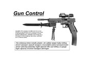
- [영미문화] Gun Control
- *은* | 11 페이지
- 1,500원
문서 초안을 생성해주는 EasyAI